Meet The New Logo...
From the original Analog Industries archive. Some links and images from that era no longer resolve.
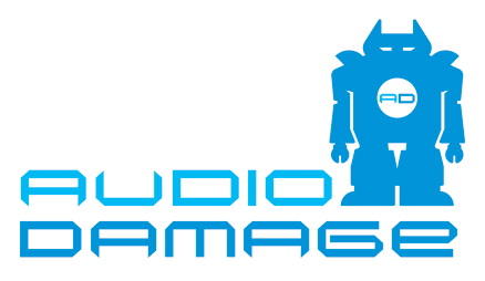
Mad props to the Men From UNKL who made the new Audio Damage logo for us. I’ll be merrily re-branding everything to match the new jammie while my lovely and talented wife re-builds the AD website to fit. It’ll be a Process more than a Pageant, and will take a while. Eos will be the first product to carry the new badging, of course. I’ll put up an updated screenshot tomorrow.
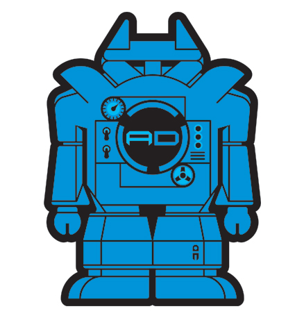
They also made us a more sophisticated iteration of Lil’ Blue, our new ’bot, which can be seen below. So, out with old and busted, in with the new hotness. Also, we’re now Official Members Of The Steinberg Circle Of Trust, and as a result, you can see all kinds of bullet points and market-speak in the Steinberg Plug-in Zone about AD, and in some fairly lofty company, considering all but one of those businesses we share the page with probably have, like, mailrooms and stuff. If we actually had a Phase Two In Our Plan For World Domination, I’d say we were moving in to it. We don’t, but that has kind of a poetic ring to it, so I might extrapolate that shit out in to an actual Plan, with Phases and stuff. I’m sure Adam will be bemused.
Anyhow, back to business. Eos is coming along nicely. Some bugs in the Windows version, which is otherwise pretty much done. These have to be hammered out before the Mac work can start, but we should be moving at our normal punk-rock clip now. You all know what that means.
10 comments
i dig it. much improved! money well spent.
cool
I don't know about a mail room, but I reviewed something by Arturia -- their Arp Odyssey 'clone' or something, and it came with an Arturia ball point pen and Arturia post-it notes.
I don't know where I put them but at some point I want to EBay them as VINTAGE ARTURIA SWAG L00K!!!
Don't know how full of techno they were. My capsule review of the Arturia Odyssey thinger is that it duplicates the UI perfectly, which is really fucking annoying when you're trying to diddle it with a mouse and the switches are 10 pixels high.
I like it a lot.
Cool. Lil' Blue = Pikku-Sini in Finnish. :-D
But you guys _do_ have a Phase Two.
I think I might accidentally cut myself on those letters.
Thats a cool logo there.
How'bout getting stickers of that bot made for AD merchandise?
Possibly squeezing a few chock full of techno stickers out while your at it?
new t shirt with new logo? :D
Tbh, I like the old robot better, but I don't count. ;)
Comments are closed on this post.